Website
Cosplay.com is a social site that revolves around the similar interest of cosplaying ("play" "costume"). Users take pictures of themselves in their costumes and upload them to this site. Because of the idea of this community is about everyone dressign up, I wanted to focus on the users and their photos.
NOTE: I'm not very fond of the colors, I'm thinking of maybe brightening them up.
NOTE: I'm also not sure if I should use the existing logo, or this one.
NOTE: I still want to design the search and user welcome page.
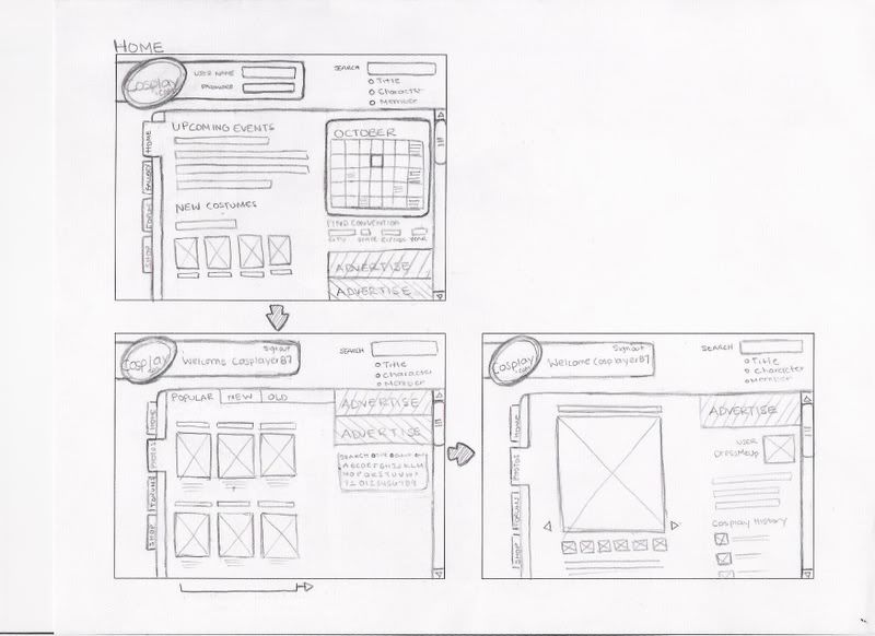
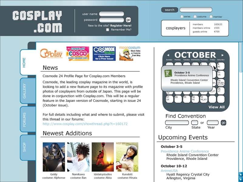
Home-1 This is the landing page. It has the news and new entries. Along with that, there is a calender with all the upcoming events. As someone who is interested in anime conventions, I would love to be able to search which conventions are comming up.
Home-2
 Because the calender only shows the state abbreviations, when the cursor hovers over a date, a little window pops up giving more information. The same information is given under upcoming events.
Gallery-1
 Gallery has rows and rows of member's photos. I set it to be on the most popular, meaning these images are the most viewed.
NOTE: There are a couple of images of me and my roommates cosplaying ^_^
Gallery-2-User-1
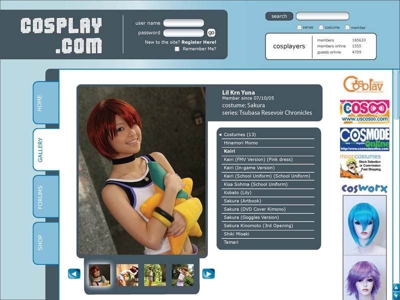
 Lets say I clicked the second image in the gallery, it will take me to the enlarged image along with the users profile.
Gallery-3-User-2
 This is after clicking "costumes." The menu shows all of the costumes the user has posted.
Gallery-4-User-3
 Clicked "Kairi." The first image appears.
Gallery-5-User-4
 At the bottom of the image, a scrolling bar can be found showing the user's photos. The idea so far is for it to be flash (this is the only flash).
 This is the landing page. It has the news and new entries. Along with that, there is a calender with all the upcoming events. As someone who is interested in anime conventions, I would love to be able to search which conventions are comming up.
Home-2
 Because the calender only shows the state abbreviations, when the cursor hovers over a date, a little window pops up giving more information. The same information is given under upcoming events.
Gallery-1
 Gallery has rows and rows of member's photos. I set it to be on the most popular, meaning these images are the most viewed.
NOTE: There are a couple of images of me and my roommates cosplaying ^_^
Gallery-2-User-1
 Lets say I clicked the second image in the gallery, it will take me to the enlarged image along with the users profile.
Gallery-3-User-2
 This is after clicking "costumes." The menu shows all of the costumes the user has posted.
Gallery-4-User-3
 Clicked "Kairi." The first image appears.
Gallery-5-User-4
 At the bottom of the image, a scrolling bar can be found showing the user's photos. The idea so far is for it to be flash (this is the only flash).
Final NOTE: The viewer does not have to log in or have an account to view this website.