Web Site Sketches
Note:
-I don't want to force the user to log in on the Home Page. This website is open to the public, meaning you don't need to be signed in to look through the site.
Set ONE
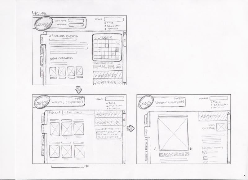 What I like about this design is the tabs.
I want the logo to be seen no matter how far you scroll, so it has its own scrolling bar.
Set TWO

I tried to do something decorative with the logo.
This design reminds me too much of myspace on how the profile/menu is on the left side.
Set THREE
This design reminds me too much of myspace on how the profile/menu is on the left side.
Set THREE

Using the tabs once again :)
I'm not sure how I feel about the background pattern. I feel like a lot of websites have already done this.
Extras
I'm not sure how I feel about the background pattern. I feel like a lot of websites have already done this.
Extras


4 comments :
i really like the first set. it's well organized, and there is still a lot of information presented on there. I look forward to seeing digitals.
ps. check out mine if you get a chance, I posted them late, so please comment. - Asher
#3 would by my recommendation. mainly because the side nav can get complicated especially if its vertical type. think about window sizes on monitors and the necessity to increase menu categories.
the tab feature works and particularly the top is the most conventional.
interested to see the graphic elements in the design.
btw do you do this stuff?
you said "but I'm not sure if you have a well organized grid"
I do not, lol :)
I can't tell by your sketches. I have a hard time seeing peoples sites in sketches. But I like 1.
I like the file/tab idea
Lea
I think I like the first set best. All of them kinda confuse me a little bit though... I think it will help me if you explained them or when I see the digital comps.
Amanda
Post a Comment