Logo sketches: Radio Station
I decided to work on a logo for a rock radio station. I chose KROQ because its one of the few (two) radio stations I listen to.
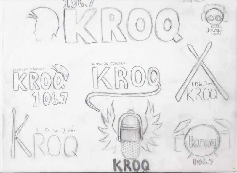
set ONE: The first one is a guy with a mow hawk (not a trojan).
set TWO: I was wanted something more rugged, so with the first one I tried to make the type very messy, but it maybe too busy with the decorations. The fist is supposed to have bandages with KROQ written on them. I really liked the cassette, because its retro. The last one is supposed to be a guitar pick.
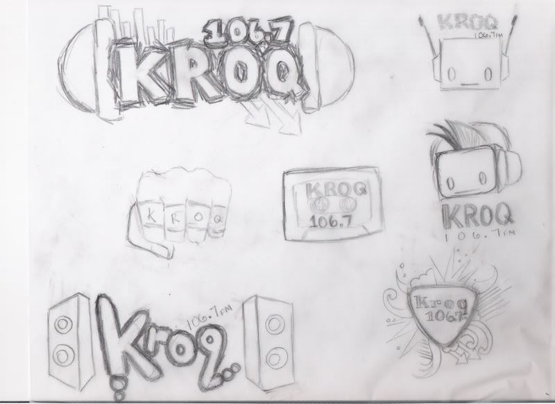
set THREE: (I tried to clean up the ones I found the most interesting). I tried not to do guitars and boom boxes, because I feel they are over used. I was trying to not use head phones too, but I just liked them too much.


6 comments :
those are cool. i like the one with the fist
The middle one from set 1 is interesting. I like how you extended the Q into a wire.
The bottom half of set 3 looks has a unique touch to it. I like all of them but the one on the right bottom corner stands out the most to me. =)
I really like the last set when you have picked my favorite ones. I liked the guitar pick as well. I also liked how you used the drum sticks in the K and broke it. That was creative but im not sure if I like rest of the font tho. I think if you can find a good font for it it could work great.
Lucineh :]
I like the one in the middle on the first page. The one KROQ that a little wire, microphone is out of the letter "Q" to somehow underline the word. The one that says WORLDS FAMOUS on top. I think it's simple and yet fun and could work for a radio station. One thing I would change about it is to increase the size of "worlds famous". The way you currently have it, is hard to read and it will be harder if you decrease the overall size of the logo.
The one that has a knuckle works best I think. The impression is really direct and powerful. The one that has a microphone with wings is cool too but since it's more complicated it might not work well if it's single color.
Nice creative designs! I like the fist. I think i have never seen a design like that for radio so it's unique and very strong design.
Post a Comment