Digital Logos
First off, I would like to thank everyone on your comments and suggestions. However, I decided to do the little robot logo.
Main Logo:
The reason why there are two, is because I don't know what eyes to choose. The one on the left is a stroke (I like it a lot better than the second one), and the one on the right I distressed myself. But, if you guys are really turned off by the stroke, then I will work harder to make my one distressed eyes look better.
Isn't he cute? He is listening to music while the head phones are plugged into himself. Talk about being self reliant.
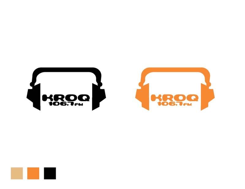
Secondary Logo:
No matter what, the lil robot is my main logo, but when ever he is being a diva I will be using this logo. LOL


13 comments :
The two logos ideas are interesting. But I don't know if it conveys the rock feel of kroq. May be my distressing the images a little bit and the type. also the color are too pastel. Give the color some boldness to it and impact. Is this design from japan influence. It kind of reminds me of that.
Justin B
Both of your logos are well constructed and eye-catching. The black and orange are a bold combination that express a jarring rock attitude.
I love the type choice. It reminds me of the 90s and thats a good thing. Sorry, but I'm not feeling the robot. Great robot, but I don't think it really represents KROQ, even though Kevin and Bean are funny. Its considered more of a teen/adult station. I do really like the little deep red motif you have on the blog under the second image. You can use that texture for the logo. I think it would add a little rock element to the fun type you have.
such a cute choice! i would go for the one on the left like you said..i like the fact that his eyes look more realistic than a circle shape..the choice of type goes very well with the logo...it does give a KROQ feel to it! but i do agree...the robot doesnt give a "rock" vibe.
If you must go with the robot I would choose the one on the right. Since it is a robot I would expect the eyes to be perfect circles. The colors are nice but I think they could be stronger.
I love the robot guy. I think the eyes on the left works better. They're more robotic-like. I kind of want to see it in other colors though. maybe a gray robot that has a light blue gradient. Good typography usage. :]
-Jenny
i really like the robot although it's not what you always see on a rock station logo i think that's good. it stands out and is memorable.
faith
I liked the robot, although doesn't seem like it would be a radio station logo. I like the one on the left. I think that both of the eyes seem fine to me. I'm not sure about the type.
cynthia
Go with the eyes on the right because on the left it makes the robot looked bored, he/she doesn't look like he's into the music being played. Where the eyes on the right the robot looks focused like "oh ****, I'm listening to some intense music"
-Paul
The right one on the first page is very well designed. it's the one with the better rounded circles. nice choice of colors. One thing I would change about it to space them out a little bit more. KROQ is too close to 106.7.
I like the right robot logo. His eyes look more... robotic.
☁Christine☁
Both logos are interesting but I like the secondary logo more because it's more clear and simple. I like how you incorporated those headphones as well. I think the one thing I would try is to increase the leading with the words KROQ and 106.7 FM. =)
Sarom R.
Cute logos! But I'm thinking if it is too cute for a rock radio station. I like the main logo more and I think maybe you can try to use LP records shape to replace those 2 little guys' eyes. That would make the impression stronger. That's just my opinion.
Post a Comment