Stationery Drafts
Hey guys,
sorry I'm uploading these late, but I was sick this morning so here they are...
I had to change my logo a bit, because to be honest, I also believe its wasn't rocker enough (even now I still think it needs work).
errr... the bottom business card has the phone and fax numbers on the sides. It came out yucky looking.
-_-
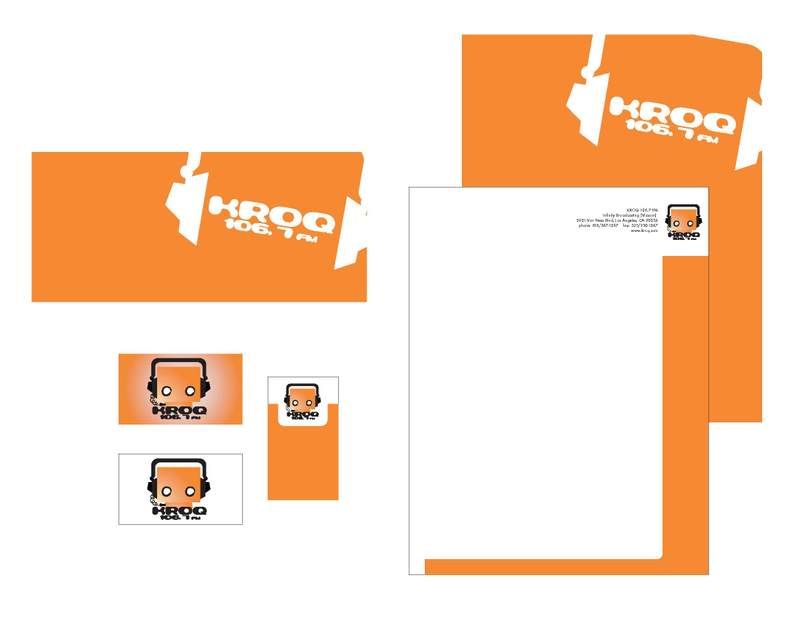
Note (Below):
These are the old drafts before I changed the logo.

3 comments :
When I look at the icon, I don't get that KROQ vibe but I do get a sense that it belongs to a radio station.
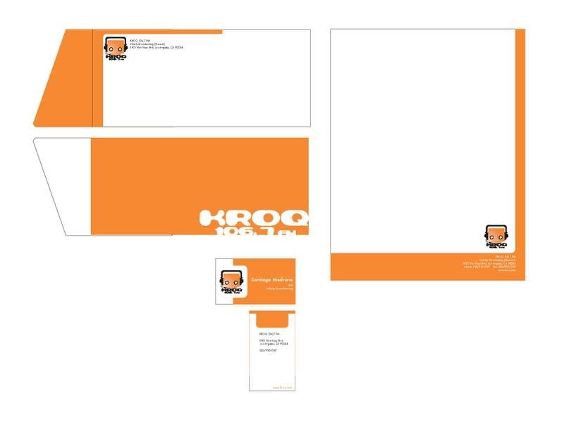
I think that what you've done with the stationary is very creative. The blue one is my favorite. I like the idea of the envelope flap, it gives it a clean but edgy look. The letterhead is unique because of how you've incorporated the headphones on the side. For the business card, the one thing I would change is the spacing of the address and the silhouette of the headphone from the bottom. I think that it's so close to the bottom that it creates tension for the viewer.
Overall, I think what you're doing is great so far. =)
Sarom R.
I like the design but I like the color from your old one though. It is wise to use contrast color but I will look for other blue instead of this one. So keep the color scheme but try to explore more.
hey i really like your logo and your stationary...i like the detail cut out on the flap of the envelope. very cool. i like the orange stationary but i like the blue better. really nice=).
Post a Comment