Thursday, February 19, 2009
Tuesday, February 17, 2009
KROQ: Billboard and Bus wrap
Billboard:
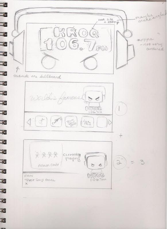
 (p.2 I like the first and third ones)
Bus Wrap:
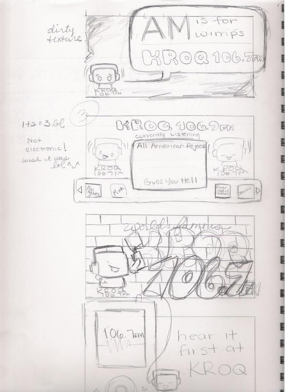
[edit] I thought the design was going to be on the white space from the bus template. These sketches are not to the bus proportion. However, it'll be the same concept when designed to fill the entire bus. Sorry for the confusion.

Top-matches the top of p.2
Middle-matches the graffiti billboard. On the sides, there will be band names gratified.
Bottom-just trying to be funny, like if you don't listen to KROQ, the robot will get mad and will turn the bus around.
[edit] Reminder: I thought the white line was the are we were supposed to design... so I'll have to change these to fit the bus. -_- I will fix it!
Tuesday, February 10, 2009
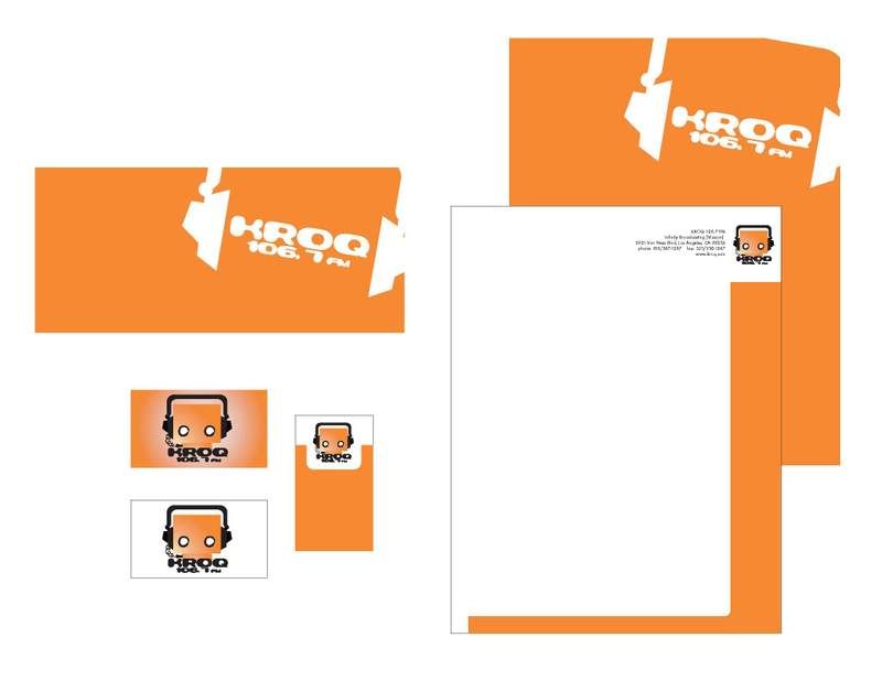
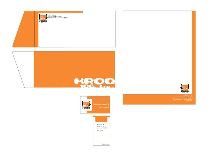
Stationery Drafts
Hey guys,
sorry I'm uploading these late, but I was sick this morning so here they are...
I had to change my logo a bit, because to be honest, I also believe its wasn't rocker enough (even now I still think it needs work).
errr... the bottom business card has the phone and fax numbers on the sides. It came out yucky looking.
-_-
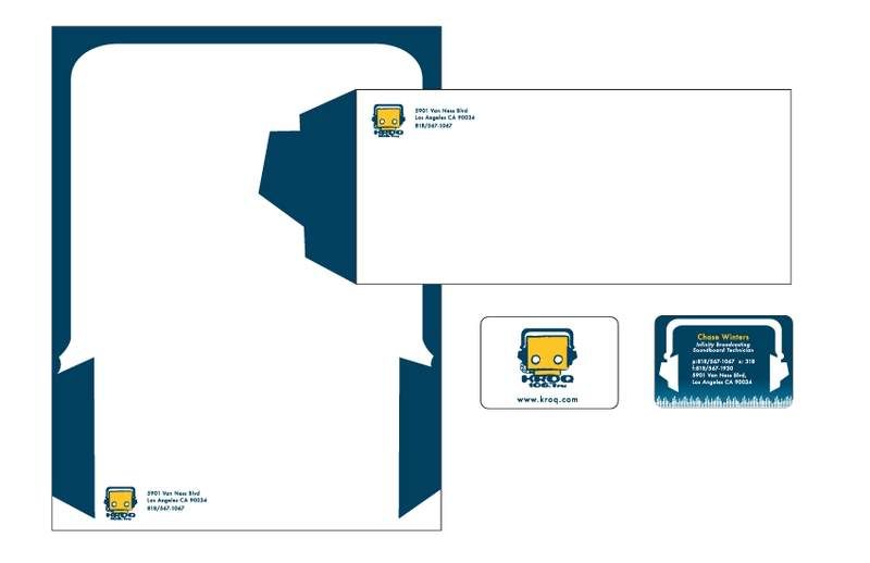
Note (Below):
These are the old drafts before I changed the logo.
Thursday, February 5, 2009
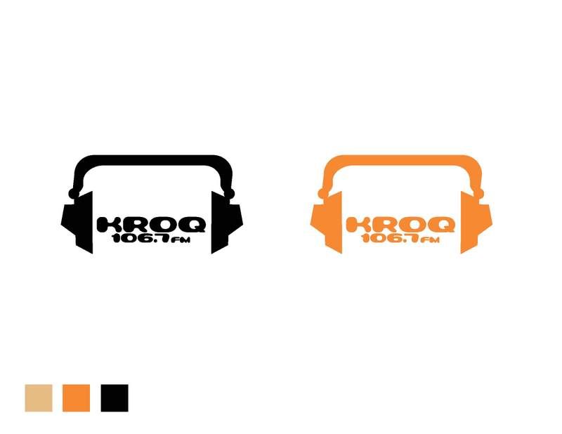
Digital Logos
First off, I would like to thank everyone on your comments and suggestions. However, I decided to do the little robot logo.
Main Logo:
The reason why there are two, is because I don't know what eyes to choose. The one on the left is a stroke (I like it a lot better than the second one), and the one on the right I distressed myself. But, if you guys are really turned off by the stroke, then I will work harder to make my one distressed eyes look better.
Isn't he cute? He is listening to music while the head phones are plugged into himself. Talk about being self reliant.
Secondary Logo:
No matter what, the lil robot is my main logo, but when ever he is being a diva I will be using this logo. LOL

Subscribe to:
Comments (Atom)
