Poster Ideas
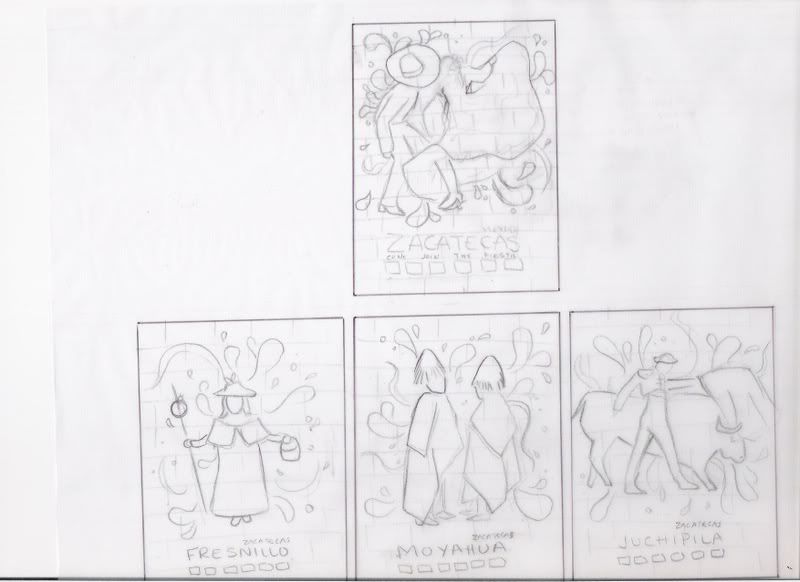

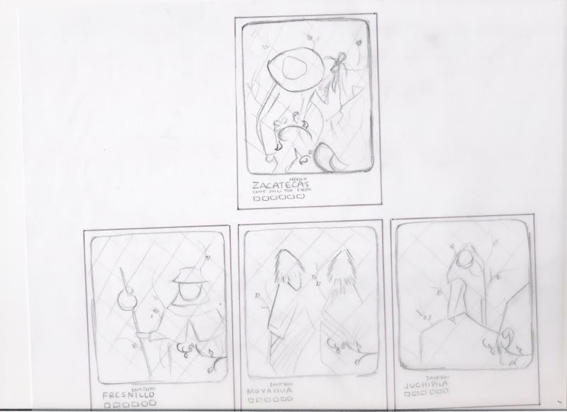
After working on my Sun Comps, I was not satisfied. I decided to come up with new ideas. While Joe was showing us past student work, I realized I was drawn more to the simple ones that only changed colors. I wanted to try to do something like that. This was my first atempt, which I don't think is too successful. /barf
I am so in love with this one. I can probably play around with the type a bit more, but overall these were the colors I wanted to do. It creates a festive atmosphere/mood. YAY! What do you think?
^_^
It reminds me of a piñata. YAY!
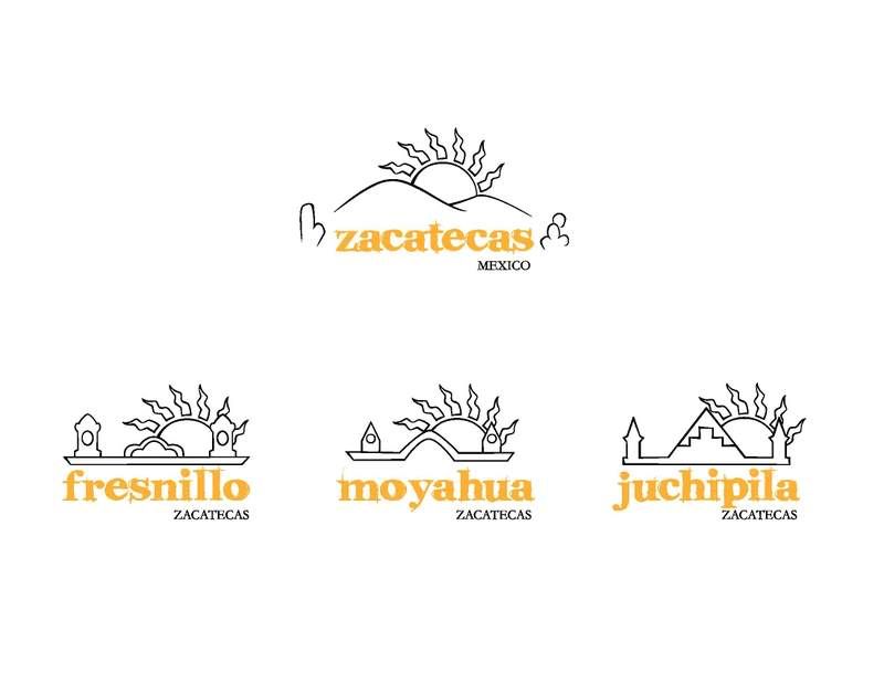
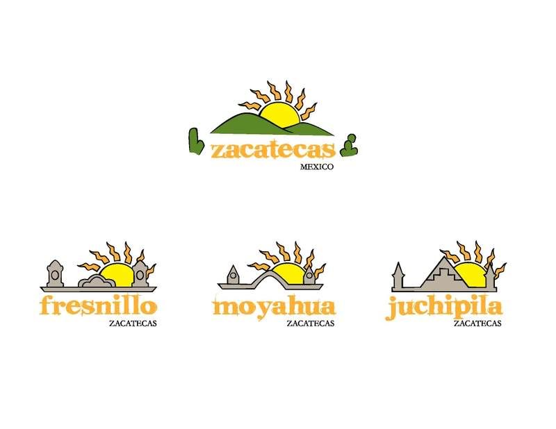
 In this set I wanted to incorporate Mexican architecture and landscapes.
 On these I wanted to focus on the people and culture.
 The shape of the state is a window to the landscape and architecture.