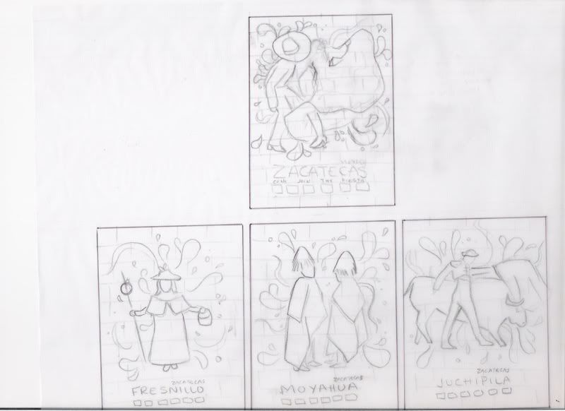
 This is my first idea I was thinking of making it seem like it was painted/sprayed on to a brick wall. I wanted to show the people in relation to the local events and festivities. The splash in each frame is to illustrate the energy of the moment.
 I wanted to show a picture of each individual city, highlighting the architecture. Each sketch has a playful border with festival flags in order to portray an enjoyable experience.
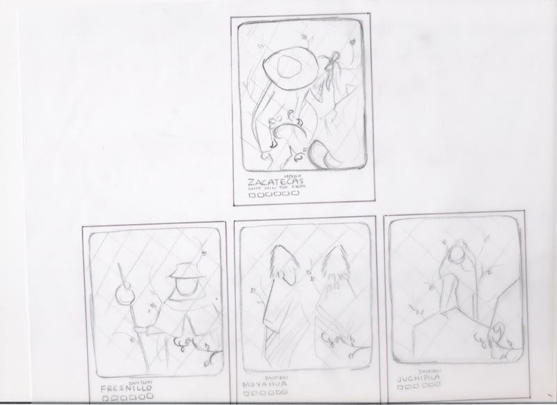
 I like the illustrations of the first sketch, so I wanted to use it again with the incorporation of a new background pattern.


3 comments :
I love the first set! I can totally picture it illustrated and looking like it was painted on a wall.
The second set reminds me of a restaurant, lol. I'd like some rice and beans with my tacos, hehe jk;)
And the third is ok.
I think you should do the first, it has interest and is a neat and different idea.
i like the first and second. first one is more detailed to me more. it all great
roy
just to confuse you more...
i think the third set is working the best. mainly it allows for your complex logos to stand on their own in a space that allows them to be legible. you can still use the wall texture and the illustration from #1 but at least your tagline and logo can work outside of the image.
its also a nice branding feature in all ads to unify them more.
joe
Post a Comment