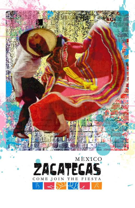
Poster Comps
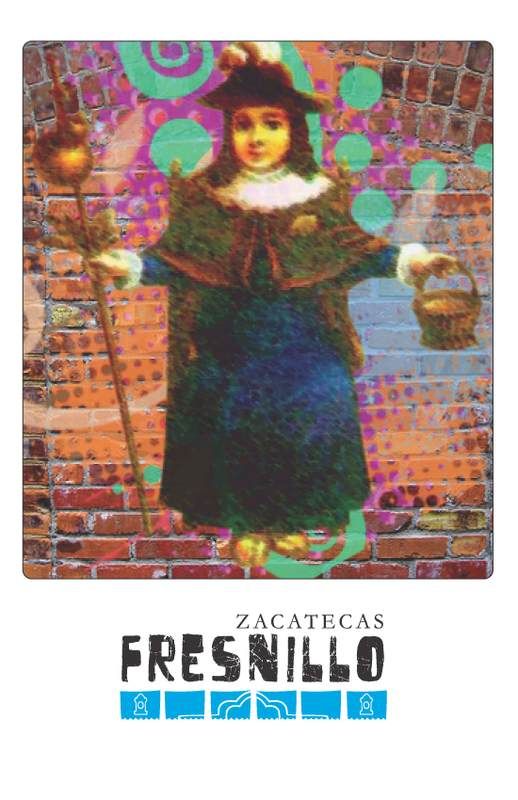
Set ONE
Don't worry... these are not the finals lol
I will be creating my own swirls and splats in the background. I am still working on the images to seem a little bit more sketched out.
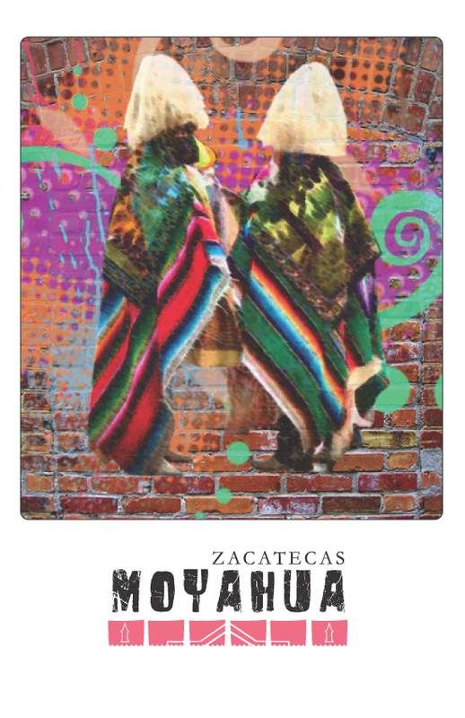
Set TWO
These have different splats, as well as different walls. I tried to play around with the splats breaking out of the frame.
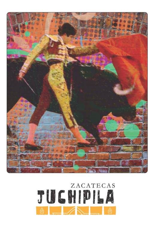
Set THREE
Instead of splats, I tried to do something floral. I actually think this is cute.


5 comments :
i think the first posters are the strongest. and i kinda like the pop feel to them keep it up
me gusta
nice textures overall.
set one is clean - love the backgrounds
set two is more colorful - love the chroma (intensity) and oversaturation
set three - love the flowers on the bottom of the left one.
so take all that i love and make something beautiful. that is if you agree and that it doesnt look too busy
great work jahaira.
joe
I like the faded look of the first ones...I also think the flowers are cute..that would make good stationary. Hey! it looks like they are snogging underneath that sombrero! lol.
I like the flower ones.
I like the patterns on the first set, but maybe not on the image also, kind of a lot going on. I like the idea though
Lea
In terms of layouts and overall designing, they all look great and all I can really say is that you simply need to either go with one idea (whether it's the flowers, or the splats etc.) and make variations of it for your environmental, OR, use different elements for each separate environmental ad.
Good stuff!
- Oleg
Post a Comment