Monday, November 10, 2008

Jarritos Hand Sketches

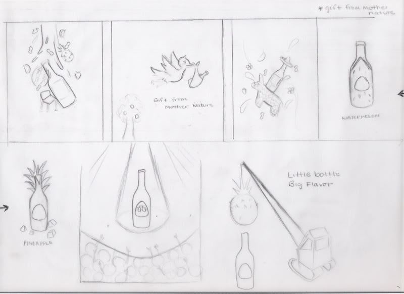
Carlos and I rethought our direction. While sketching ideas, we thought we would try to be more humorous with the campaign. We still have some sketches where we focus on pretty images, but we liked the idea of being funny.


Page ONE
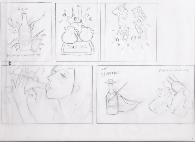

Everything on this page seems to be only pretty images, however I really like the second image of the fruit flavored water being dropped into the pitchers and also the last image of a Zorro Jarrito.


Page TWO


I really like the FlashDance reference. Its so cute! I also like the stork carrying a Jarritos. Its tying in mother nature with fruits= "Gift from mother nature." hehe. The little Jarrito riding the piƱata is also adorable, but its not too creative.


Page THREE

These are some ideas Carlos and I were playing around with. The bottle jumping into the pool sounds really refreshing, hopefully tempting.


Page FOUR

I really like all in this page. The top two remind me of when I was drinking Jarritos and we couldn't find a bottle opener. We decided to use the side of a chair, "hey, as long as you get to your goal."
The bottom left is also very cute. I feel like I can tie in other sketches to this one.
The bottom right is really funny. Keeping the cultural aspect, the Jarritos are dressed up as Mariachi players and are serenading a lady on the top floor. LOL


StoryBoard

Commercial 1: A group of girls are out, and are playing paper rock siscors on who will be the designated driver that night. The loser doesn't seem too happ, she the discovers Jarritos at the bar. Her friends notice what she is drinking and change their minds to drink Jarrito soft drinks as well.

Commercial 2: (This plays off of my experience) Not being able to find a bottle opener, the guy becomes frustrated. A girl comes in and opens it on a side of a chair (this can be changed to something more interesting than a chair). "As long as you get to your goal."

Commercial 3: A little boy is playing the guitar to a little girl. He fails as a guitar string rips. The girl is not happy. No problem, resort to plan B: Jarritos. The girls is happy!


Monday, November 3, 2008

Advertise Campaign Styleboards


History: Started in 1950, Jarritos is the first national soft drink brand in Mexico. It is the leading brand in the mexican soft drink category in the U.S and a mexican cultural icon. Jarritos is available in eleven fruit flavors: Tamarind, Mandarin, Fruit Punch, Jamaica, Lime, Grapefruit, Guava, Pineapple, Strawberry, Mango and Watermelon.

Product:
Jarritos, a Mexican imported soft drink.


Competition:
Other soft drink especially fruit flavored such as Fanta. The Coca Cola Company and Pepsi Company are big competitors to Jarritos
not only in the U.S., but also in Mexico.

Target Audience: For everyone; however it should appeal to Mexican viewers the most. The image should be family friendly.

Strategy: Use fruit based colors. Have it be festive and colorful. Overall EYE CANDY.

Style Boards:

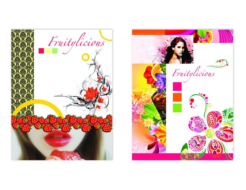
On my first directions I was going for
a more youthful approach with fruity elements.

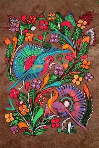
The first image has Mexican patterns used in the ride
It's a Small World (Disneyland).


With my last approaches,
I wanted to go with a little more mature look,
but still keeping the playfulness of the fruit.


Inspiration:

Monday, October 20, 2008

Website

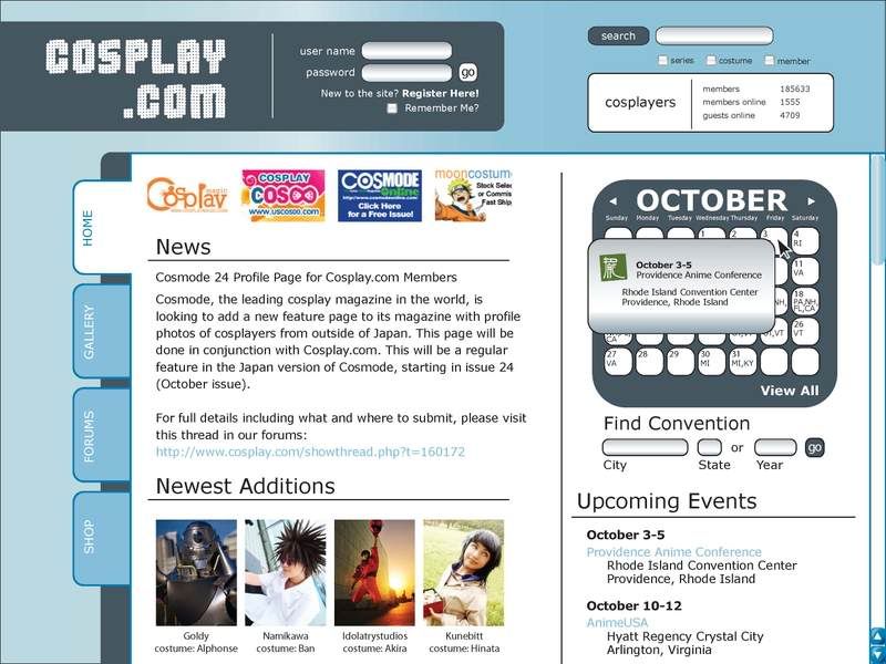
Cosplay.com is a social site that revolves around the similar interest of cosplaying ("play" "costume"). Users take pictures of themselves in their costumes and upload them to this site. Because of the idea of this community is about everyone dressign up, I wanted to focus on the users and their photos.
NOTE: I'm not very fond of the colors, I'm thinking of maybe brightening them up.
NOTE: I'm also not sure if I should use the existing logo, or this one.
NOTE: I still want to design the search and user welcome page.


Home-1This is the landing page. It has the news and new entries. Along with that, there is a calender with all the upcoming events. As someone who is interested in anime conventions, I would love to be able to search which conventions are comming up.

Home-2
Because the calender only shows the state abbreviations, when the cursor hovers over a date, a little window pops up giving more information. The same information is given under upcoming events.

Gallery-1
Gallery has rows and rows of member's photos. I set it to be on the most popular, meaning these images are the most viewed.
NOTE: There are a couple of images of me and my roommates cosplaying ^_^

Gallery-2-User-1
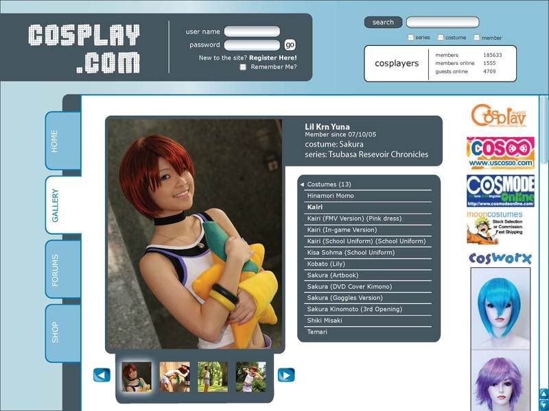
Lets say I clicked the second image in the gallery, it will take me to the enlarged image along with the users profile.

Gallery-3-User-2
This is after clicking "costumes." The menu shows all of the costumes the user has posted.

Gallery-4-User-3

Clicked "Kairi." The first image appears.

Gallery-5-User-4
At the bottom of the image, a scrolling bar can be found showing the user's photos. The idea so far is for it to be flash (this is the only flash).

Final NOTE: The viewer does not have to log in or have an account to view this website.

Monday, October 13, 2008

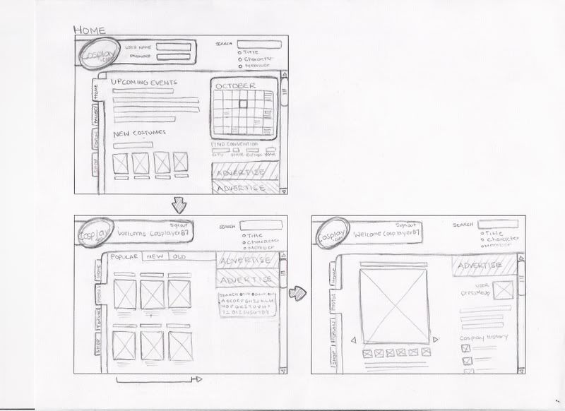
Web Site Sketches

Note:

-Squares with and X= Pictures
-I don't want to force the user to log in on the Home Page. This website is open to the public, meaning you don't need to be signed in to look through the site.

Set ONE
What I like about this design is the tabs.
I want the logo to be seen no matter how far you scroll, so it has its own scrolling bar.

Set TWO
I tried to do something decorative with the logo.
This design reminds me too much of myspace on how the profile/menu is on the left side.

Set THREE
Using the tabs once again :)
I'm not sure how I feel about the background pattern. I feel like a lot of websites have already done this.

Extras

Monday, October 6, 2008

Web Design

The good:

http://www.deviantart.com/

This is one of my favorite sites. Its designed very pretty, but not only that, the search engine is amazing. The search bar on the left is so detailed, you'll definitely find what you wanted. It also has different filters such as popularity and the date entered.
Users subscribe their art work.

http://www.newgrounds.com/
This is one of the coolest you'll ever visit. You can't go wrong, click anything and you'll come upon something awesome. Newgrounds is the leading website in flash animation and gaming. Users also subscribe their work. Click Flash Portal, and it lets you view the latest submissions, best of the week, and best of all time. Upon clicking a video, you can see the rating and comments before you view the video. On the left, you can find other work by the same user. It's also cool looking... lol


The bad:

http://spikedhumor.com/
Yes I know, this site is nice looking, but I still have a major problem with it. Although I love this website (it has the best and funniest videos), it has a terrible search engine and lack of filters, which makes it nearly impossible to find older videos. If you watched an enjoyable video you wish to show to a friend your only hopes of finding it is to go through each linear page going back by date.

http://www.animenewsnetwork.com/

Another site that I love, but I feel like its way too busy. If you have not yet guesses, I am an anime nerd (and PROUD of it). It used to be a lot more simple. The homepage would have an alphabet style search, making it easy to search titles. It took me a while to find it; http://www.animenewsnetwork.com/encyclopedia/anime.php
^_^

http://www.angelfire.com/anime2/ols/
I know this is an angelfire page, so a fan must have done this, but all the text is CENTERED OMG! Fine, I got past that, but then searching the characters profiles I find the text centered again /sigh, and the picture is all the way to the left.