Monday, September 29, 2008

Environmental and Posters

I'm having such a hard time with the Environmental Campaign. I've been trying to think of new ideas other than billboards and stuff, but nothing new is coming to mind. /sigh
I'm also thinking of using pottery, but I still need to find usable images. This lobby picture is really low quality that I may have to do it on another.
/cries


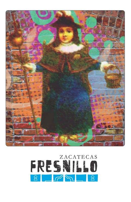
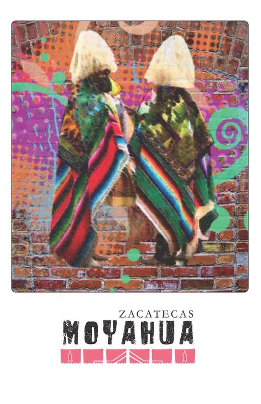
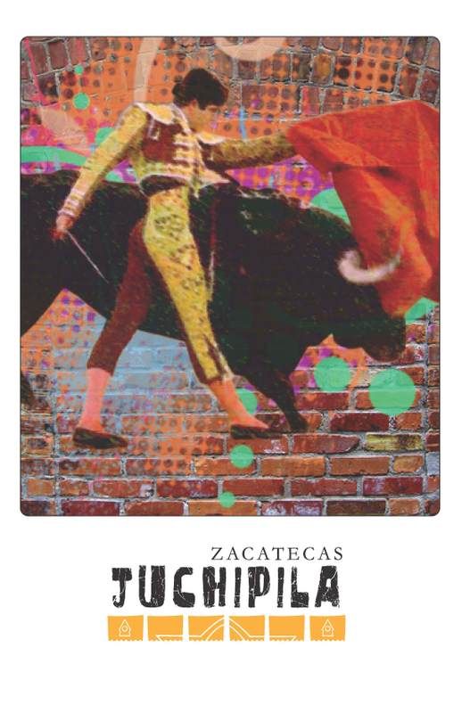
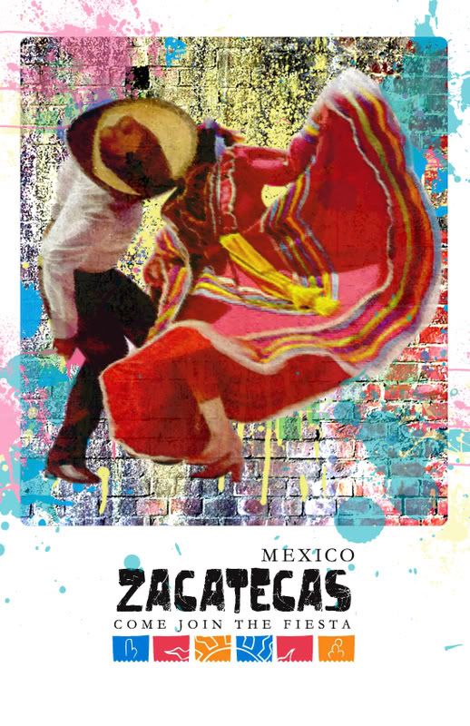
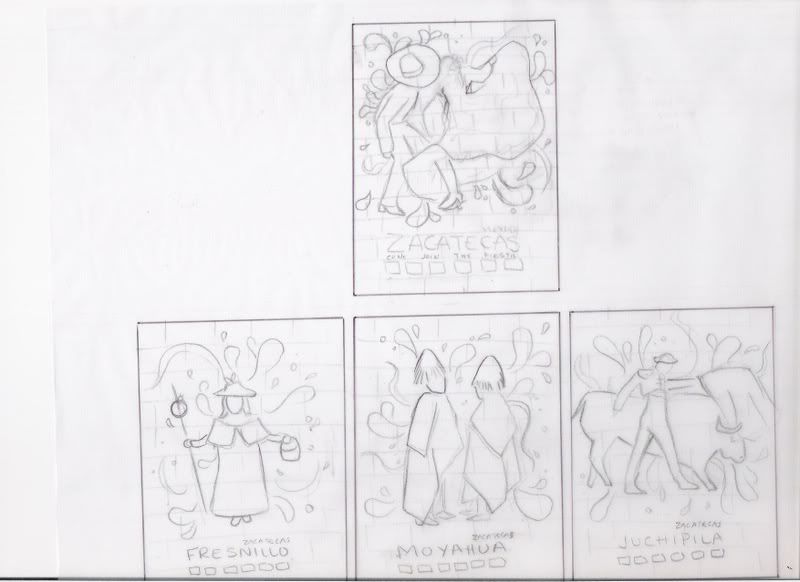
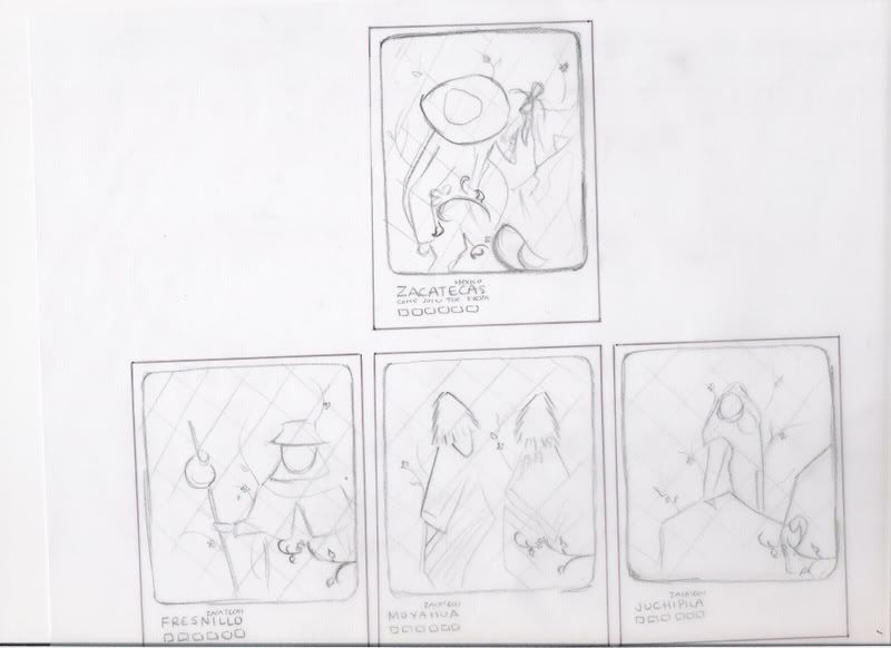
At least I have the main part of my posters done. I tried to put the splats in the background of the images but it looked way too busy with the flowers. I'm thinking of making them longer and putting a die cut at the bottom of the poster that look like the festival flags from the logo.

Monday, September 22, 2008

Poster Comps

Set ONE


Don't worry... these are not the finals lol
I will be creating my own swirls and splats in the background. I am still working on the images to seem a little bit more sketched out.


Set TWO


These have different splats, as well as different walls. I tried to play around with the splats breaking out of the frame.


Set THREE


Instead of splats, I tried to do something floral. I actually think this is cute.

Monday, September 15, 2008

Poster Ideas

This is my first idea I was thinking of making it seem like it was painted/sprayed on to a brick wall. I wanted to show the people in relation to the local events and festivities. The splash in each frame is to illustrate the energy of the moment.


I wanted to show a picture of each individual city, highlighting the architecture. Each sketch has a playful border with festival flags in order to portray an enjoyable experience.


I like the illustrations of the first sketch, so I wanted to use it again with the incorporation of a new background pattern.

Wednesday, September 10, 2008

In Progress-Comps 2


After working on my Sun Comps, I was not satisfied. I decided to come up with new ideas. While Joe was showing us past student work, I realized I was drawn more to the simple ones that only changed colors. I wanted to try to do something like that. This was my first atempt, which I don't think is too successful. /barf


I am so in love with this one. I can probably play around with the type a bit more, but overall these were the colors I wanted to do. It creates a festive atmosphere/mood. YAY! What do you think?
^_^

It reminds me of a piƱata. YAY!

In Progress-Comps 1


Wednesday, September 3, 2008

Zacatecas Logo Sketches

ONE

In this set I wanted to incorporate Mexican architecture and landscapes.


TWO

On these I wanted to focus on the people and culture.


THREE

The shape of the state is a window to the landscape and architecture.


FRAMES


These are some of the frames I used and may still use.
I am still not done with the sketches.
The one I really want to sketch is the fancy octagon.
I found it in an architectural piece as the window.
I thought it was cute.


Monday, September 1, 2008

Adjectives

1. Festive
2. Traditional
3. Hidden

DONE! Now for sketches... /sigh