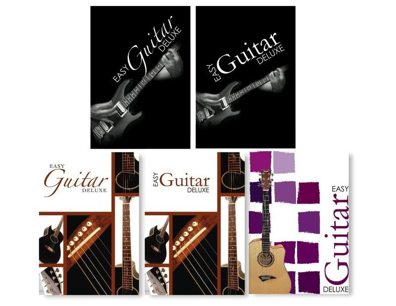
Tuesday, April 28, 2009

Binding Comps

My binding method is going to be spiral, because I liked some of the examples in class where the spiral was being hidden. I chose a stock image promo book on graffiti. When opening the book I wanted the reader to have the option of turning half the pages while keeping the others still. I have designed it so there is an A and B section. Some pages with a lot of text will be full pages (not in half).

Full Page
white or black?

Half a Page
section A and B will have different colors

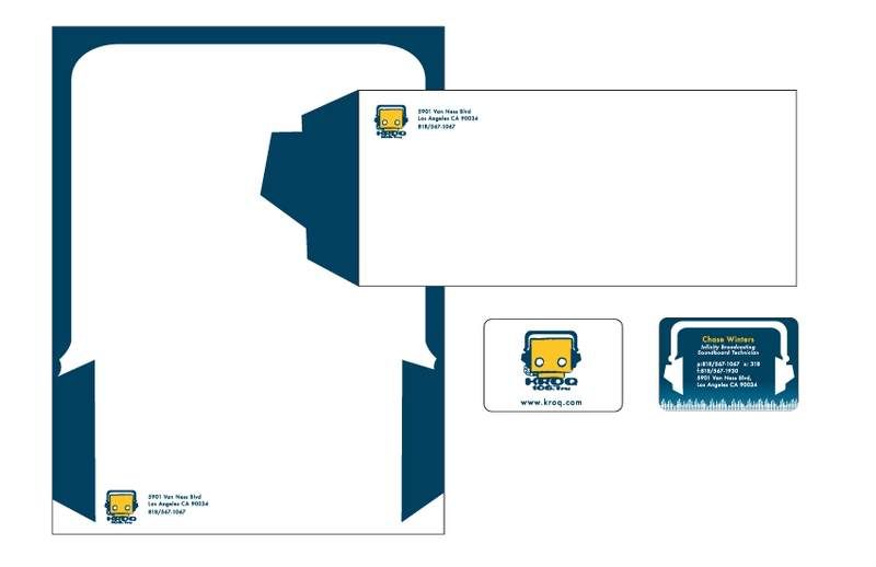
I also have a die cut next to the spiral. Since I'm doing an easy binding, I didn't want it to be a boring spiral so I added a space where there will be no binding (that's why the color is being shown through from the last page).

Tuesday, March 17, 2009

Ad Sketches


#ONE: The main image is a photo, while the instruments are drawn on. The idea is random people walking by having outlines drawn on top of them. This is to show that its really simple to learn instruments through RAC media's software.

#TWO: Once again, I wanted to show how "easy" it is to learn instruments from this program. The software is so easy to learn that its light uploading the skill into your brain.

#THREE: The same idea and #2, but not as successful. I wanted to show the individual studying the program, but she just looks blank. It seems like she is having a difficult time understanding or she is just slow.

#FOUR: I love this one. Its really funny. The idea is for a person to be completely bored with nothing to do, then they should take up a new activity such as learn to use an instrument by using RAC media's software.

I like #1 & #4

Tuesday, March 10, 2009

Software Comps

These are only comps. Most of my time consisted of trying to find images /sigh.
On the last one (purple) I'm planning to make my own stamp/tile.

Tuesday, March 3, 2009

Software Sketches

Original Design/Research


I wanted a set of programs that taught musical instruments, such as guitar, drums and piano or bass. I tried to look for softwares that had sister programs, but most of them were only for the guitar. I found this set of individual software on Amazon. I'm not sure how good it is, since I can't find reviews. The company is called Arc Media Inc. I swear, I was not trying to find that horrible of a design to re-do...

Also, for some strange reason, only the guitar is DELUXE edition. Should I take it out, add deluxe to all, or leave it as is?


Sketches

Thursday, February 19, 2009

Stationery Progress

Tuesday, February 17, 2009

KROQ: Billboard and Bus wrap

Billboard:


(p.2 I like the first and third ones)

Bus Wrap:
[edit] I thought the design was going to be on the white space from the bus template. These sketches are not to the bus proportion. However, it'll be the same concept when designed to fill the entire bus. Sorry for the confusion.


Top-matches the top of p.2
Middle-matches the graffiti billboard. On the sides, there will be band names gratified.
Bottom-just trying to be funny, like if you don't listen to KROQ, the robot will get mad and will turn the bus around.

[edit] Reminder: I thought the white line was the are we were supposed to design... so I'll have to change these to fit the bus. -_- I will fix it!

Tuesday, February 10, 2009

Stationery Drafts

Hey guys,
sorry I'm uploading these late, but I was sick this morning so here they are...

I had to change my logo a bit, because to be honest, I also believe its wasn't rocker enough (even now I still think it needs work).


Note (Above):
errr... the bottom business card has the phone and fax numbers on the sides. It came out yucky looking.
-_-


Note (Below):
These are the old drafts before I changed the logo.


Thursday, February 5, 2009

Digital Logos

First off, I would like to thank everyone on your comments and suggestions. However, I decided to do the little robot logo.

Main Logo:
The reason why there are two, is because I don't know what eyes to choose. The one on the left is a stroke (I like it a lot better than the second one), and the one on the right I distressed myself. But, if you guys are really turned off by the stroke, then I will work harder to make my one distressed eyes look better.

Isn't he cute? He is listening to music while the head phones are plugged into himself. Talk about being self reliant.


Secondary Logo:
No matter what, the lil robot is my main logo, but when ever he is being a diva I will be using this logo. LOL

Thursday, January 29, 2009

Logo sketches: Radio Station

I decided to work on a logo for a rock radio station. I chose KROQ because its one of the few (two) radio stations I listen to.

set ONE: The first one is a guy with a mow hawk (not a trojan).


set TWO: I was wanted something more rugged, so with the first one I tried to make the type very messy, but it maybe too busy with the decorations. The fist is supposed to have bandages with KROQ written on them. I really liked the cassette, because its retro. The last one is supposed to be a guitar pick.


set THREE: (I tried to clean up the ones I found the most interesting). I tried not to do guitars and boom boxes, because I feel they are over used. I was trying to not use head phones too, but I just liked them too much.